
I finally “get” how to make charts in Word! Woot! Instead of just averaging what we’re spending each month, and being depressed because we’re spending more than we’re earning, I’m hoping they help me figure out where our money is going when, so I can explain to my SO where it’s going, so we can make changes. Let’s get these charts rollin’!
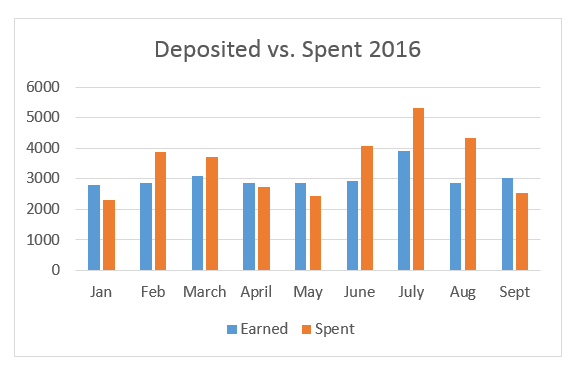
My SO and I deposit a certain amount of money into our shared checking, hence the “deposited” title at the top. (I mention this because the legend label “earned” isn’t quite accurate). Then we use that checking for everything but hobbies and entertainment with friends when we’re not together. The orange “spent” bars, then, illustrate the “everything but hobbies” spending we do.
Out of the first 9 months of the year, then, we’ve deposited more than we’ve spent for 4 months, and we’ve spent more than we’ve deposited for 5 months. The good news is this is actually better than I thought we were doing; I thought we were overspending every single month.
The bad news is that when we’re spending more than we’re depositing, we’re spending quite a bit more, which is why we’ve dipped into our savings so much this year.
My next step . . . seeing what is happening during those months where we are spending more. Are those the months our car insurance ($500 twice a year) is due? Are those months where we’ve taken a vacation? Are there other reasons those orange bars creep up?
Stay tuned for our journey into financial peace.


Leave a Comment
Pingback: Money Mysteries Solved! – Peace Out (and In) on October 15, 2016
Pingback: Deposits vs. Spending 2016 – Peace Out (and In) on October 15, 2016
0 COMMENTS